Tom Eckersley Poster Parade
09.11.2022
London Transport Museum, Covent Garden
Price – 21 pounds annual pass regular ticket for the museum (20 for students)
REPRODUCTIONS AVAILABLE AT THE MUSEUM’S ONLINE SHOP.
ALL ECKERSLEY WORKS ACCESSIBLE ONLINE AT:
https://www.ltmuseum.co.uk/collections/the-collection?f%5B0%5D=collection_type%3APosters
Although many Londoners don’t realise it, Transport for London has one of the biggest collections of specially commissioned artworks in the entire world. At the London Transport Museum, the thousands of posters in the archive are narrowed down to a select few for the Poster Parade which can be found on the first floor of the museum, behind some of the historic vehicles. It is one of my post Art History Open University degree ambitions to write a monograph on the collection of posters which bear illustrations and advertisements concerned with the world wars, destinations inside and outside of London, architecture and seasonal greetings which nestle amongst safety warnings and ticketing offers.
Most alluringly, the current exhibition boasts the work of Tom Eckersley, a twentieth century poster designer. The introduction to the exhibition summarises his signature style: “bold, bright colours and flat graphic shapes”. Personally, I think Eckersely owes much to Matisse the master, including the use of cut out colours in collages, the simplification and stylisation of figures and the obsession with the brightest hues.
Eckersely worked through the 1930s to the 1990s and managed to design over eighty posters for London Transport. At first, he worked in collaboration with the artist Eric Lombers. The exhibition describes him as ‘transforming commercial art’.
When Eckerseley was working in the 1930s, ‘posters were a hugely effective form of publicity’ the exhibition relates, although the challenge was to compress information so that it could incite further curiosity and relay compressed information in milliseconds: ‘a strong message with a simple design’. To quote the exhibition again, to achieve these ends, Eckerseley employed ‘minimal text’, conveyed messages ‘through pared-down graphic elements and bold blocks of colour’. My personal view, however, is that the posters play quite complicated visual games. I don’t see them as a visual reduction of information. They take quite a bit of decoding to understand the message shown and to understand the flight of imagination that Eckersely took to create the design.
Overall impressions of the Poster Parade? The artworks are visually stunning, richly coloured and immensely memorable. Eckersely really is a master of the poster genre. It is a delight to see the things. However, the short exhibition suffers from repetition, where nearly identical posters are displayed, and there is a certain fragmentariness where a fish poster is shown with the other half (another poster) missing. Having said that, the final word must be that the posters are beautiful, historically significant and therefore interesting because they deal with issues raised by the World War and show how heritage in London has been promoted before.
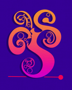
Finally, from my perspective as a digital artist that often uses flat, bold colours in my compositions, the exhibition is successful in that it shows how beautiful art can be when it uses simple geometic elements to build up its own language and communicate with the viewer. Although Eckersley uses a much more polished style than my own spontaneous ‘calligraphy-art’, the affinities are astounding, as you can see from a poster I designed recently below, and which I will finish this short summary of my impressions with:

